KEEP SCROOLING
KEEP SCROOLING
OfA is an architectural design practice aims at the designing from concept work to design details. The purpose of OfA is practicing the design part of the architecture with many elements. We practice making experimental (new) design for various project orders.
OfAは企画・構想等のコンセプトワークから空間デザイン/設計までを行うデザインチームです。
多くの要素を総合的に扱う建築(Architecture)の中で、「デザイン」を対象として業務を行っています。
各プロジェクトのオーダーに対して既存の回答ではなく実験的なデザインでの回答を目指します。
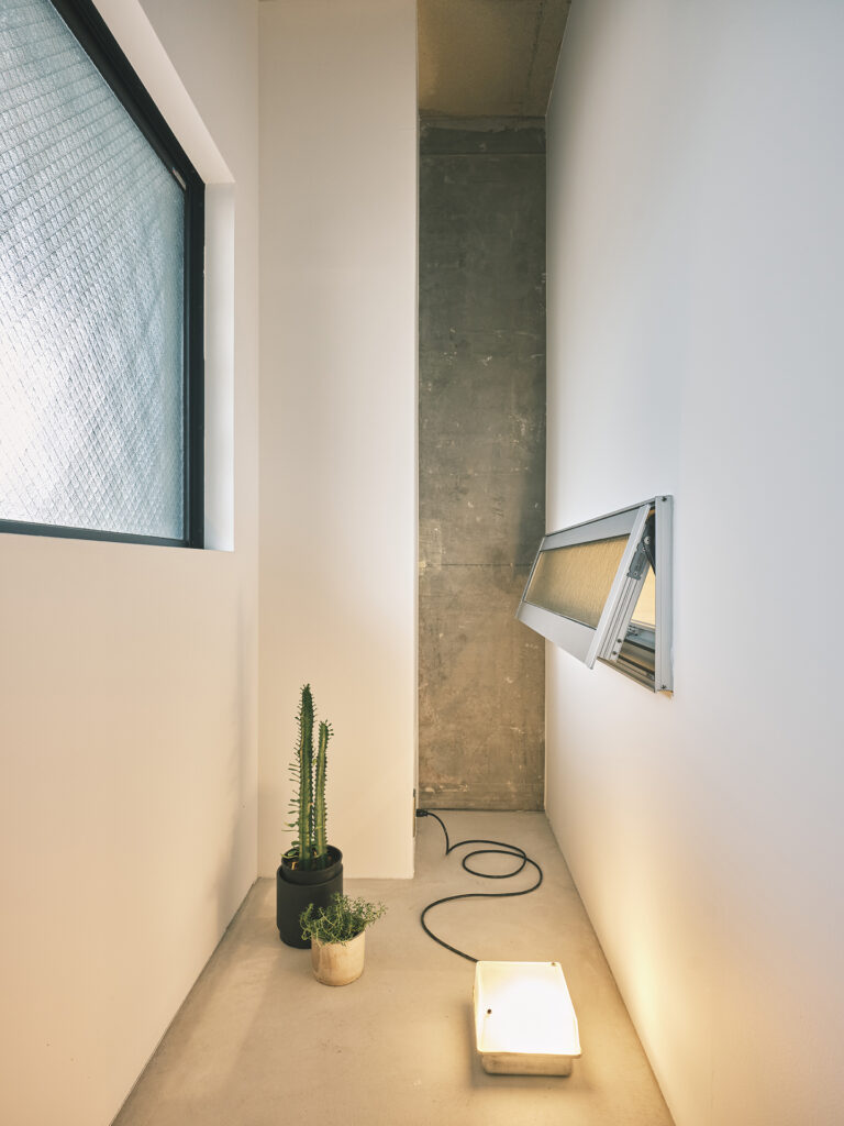
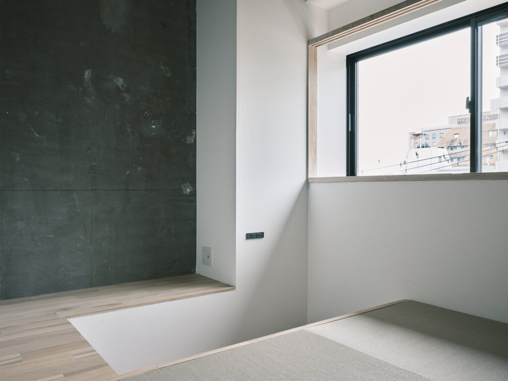
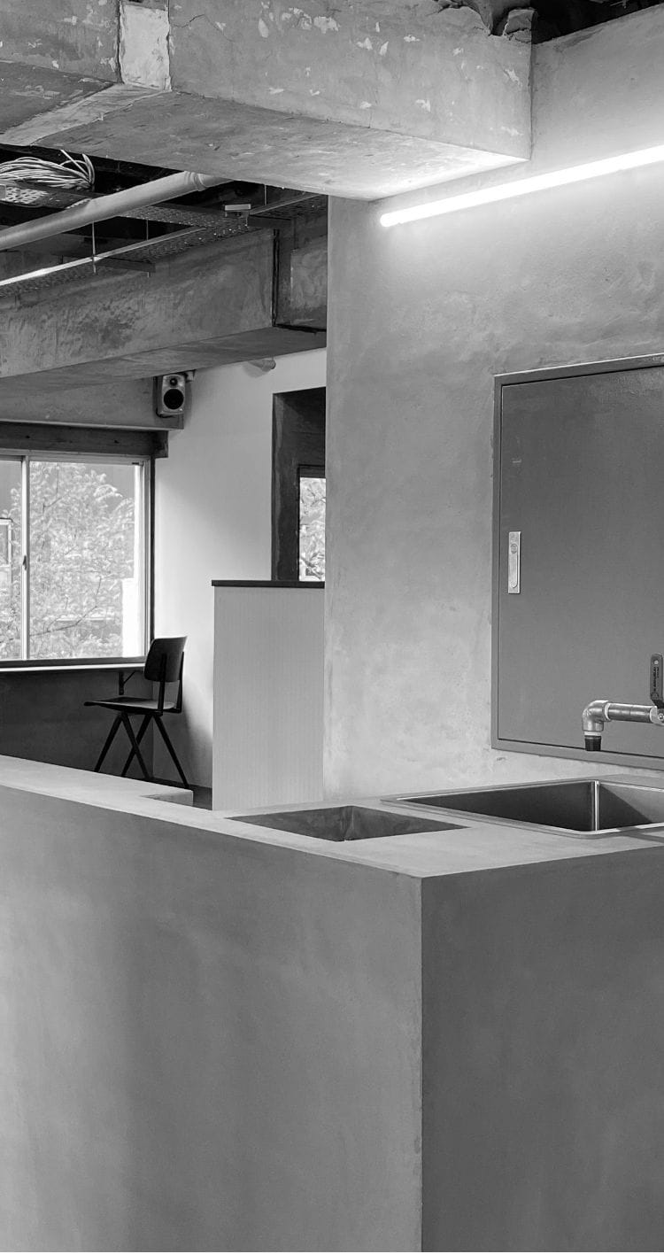
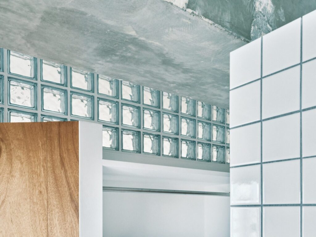
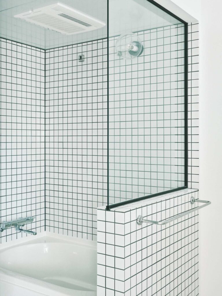
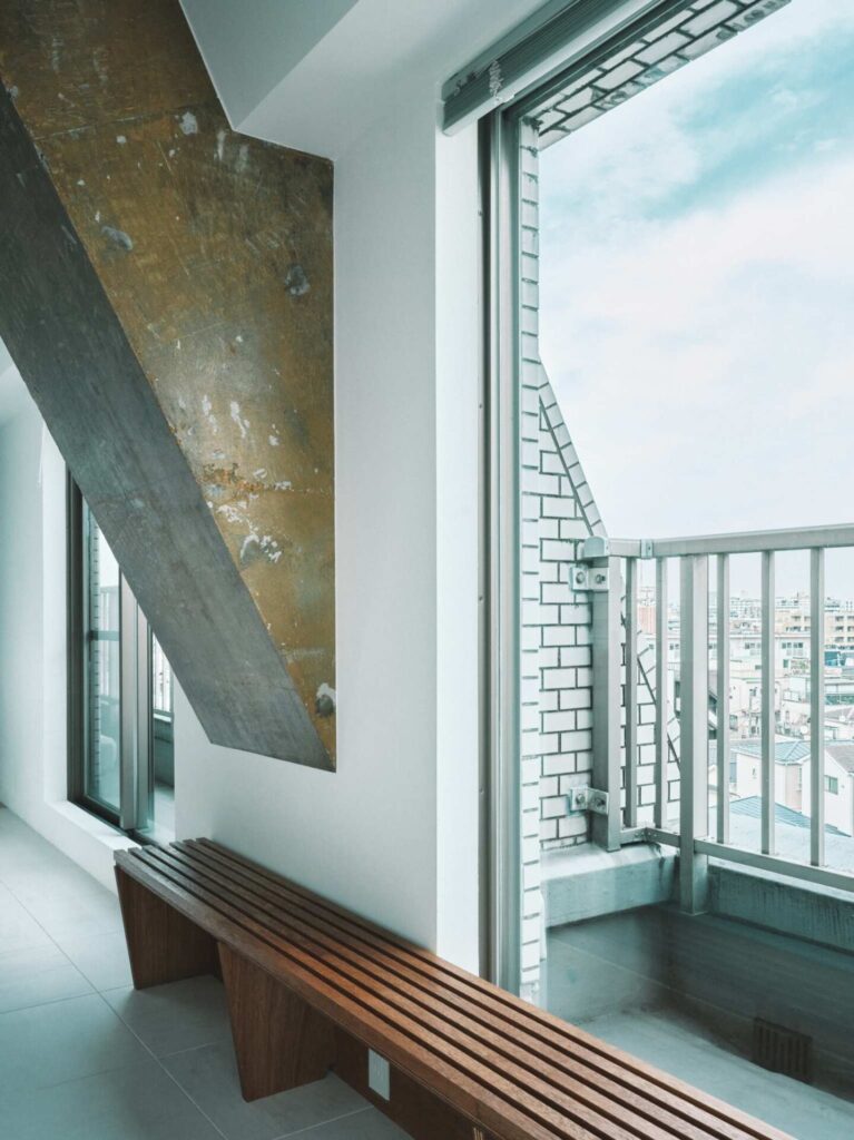
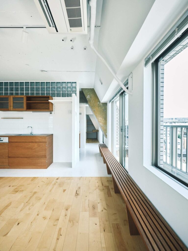
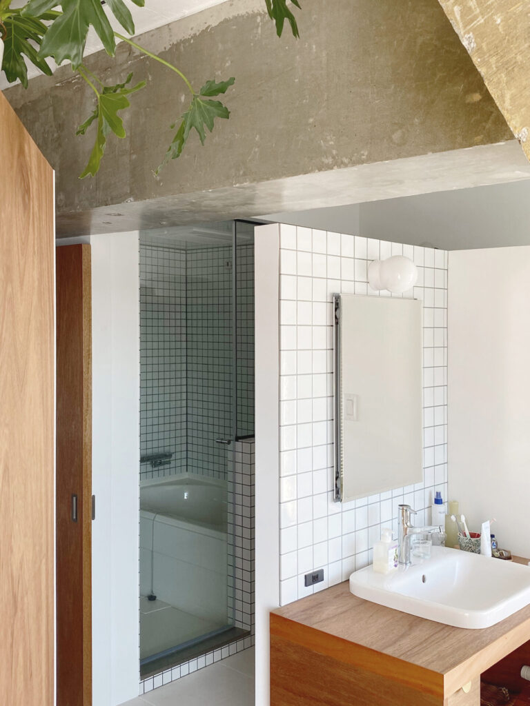
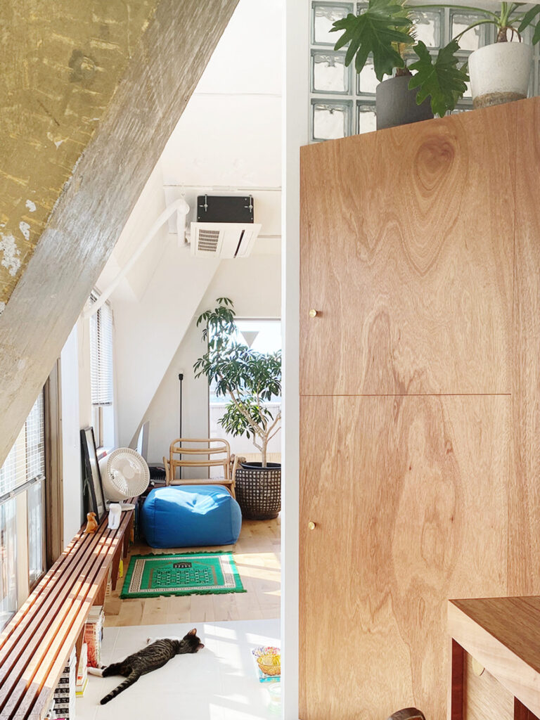
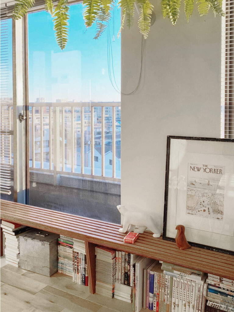
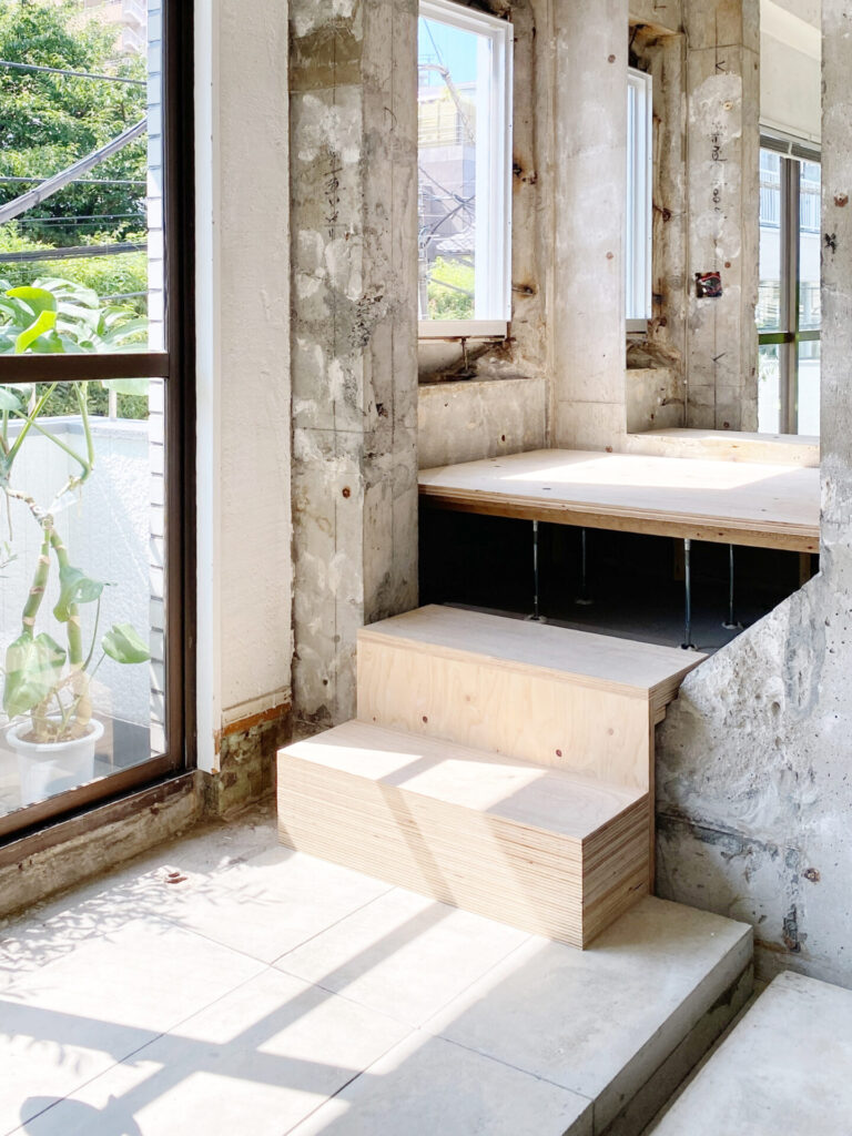
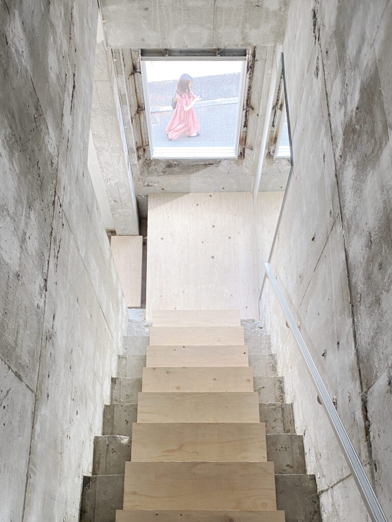
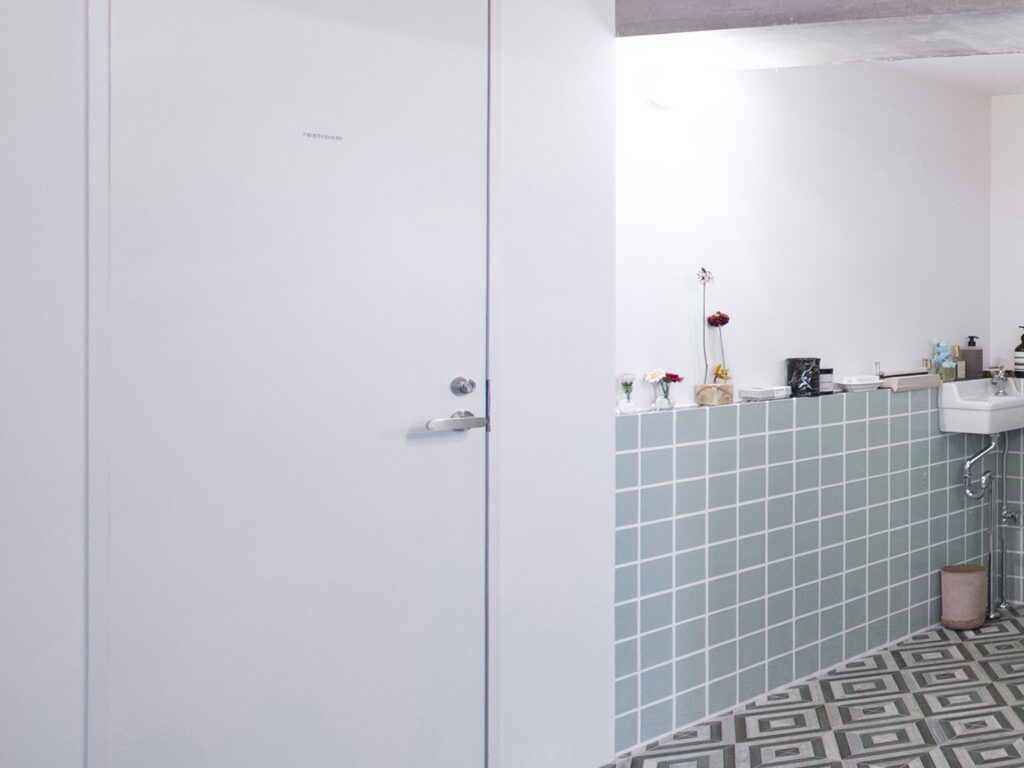
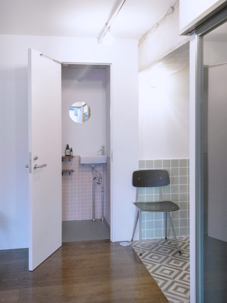
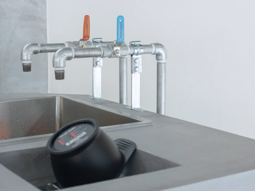
東京都でのRC造マンション1室の改修デザインである。
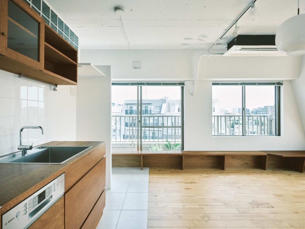
設計対象の部屋は南東向きの角部屋で、日当たりが良好で風通しのよい部屋であった。
そこで、窓と躯体で切り取られた室内だけでなく、 そのような豊かな光や風までを設計の与件として丁寧に扱っていくことを考えた。
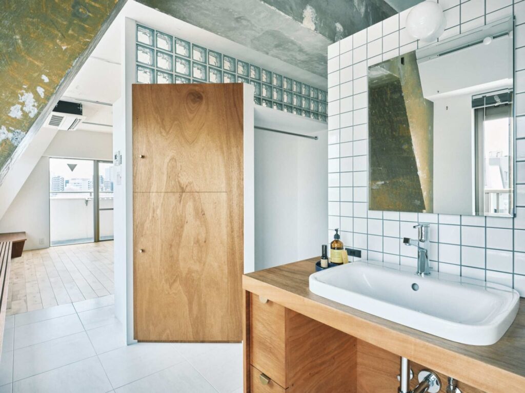
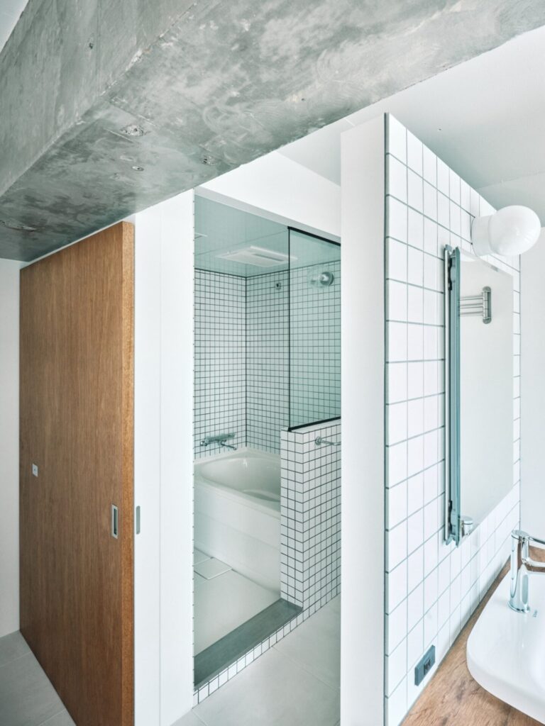
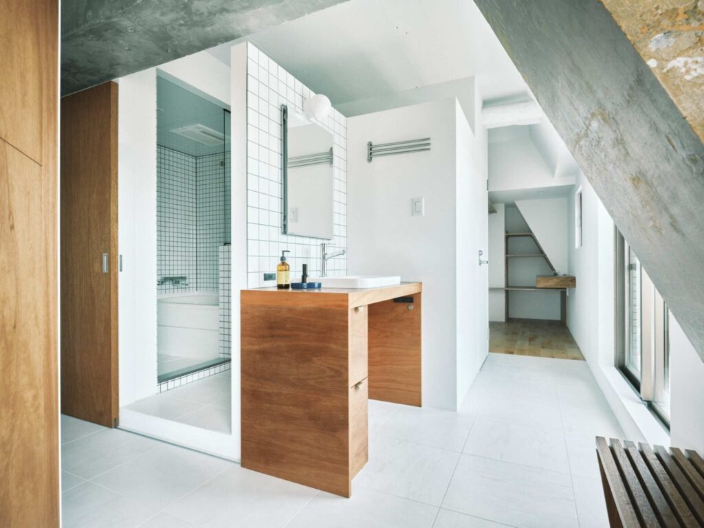
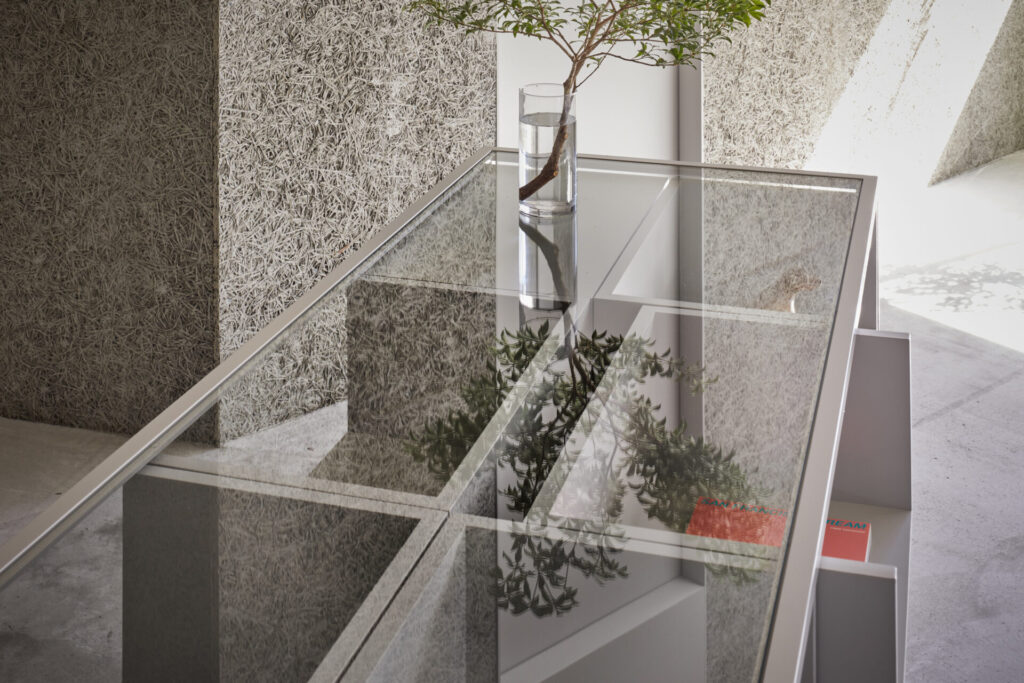
この場の光と風が、キラキラと反射するガラスブロックやタイル、鏡、洗面シンク等を通りながら、室内全体に届くように検討していく。
朝日が入る時間から部屋全体が明るくなり、ツヤのある天井に反射して光が届き浴室のタイルまでを明るくする。
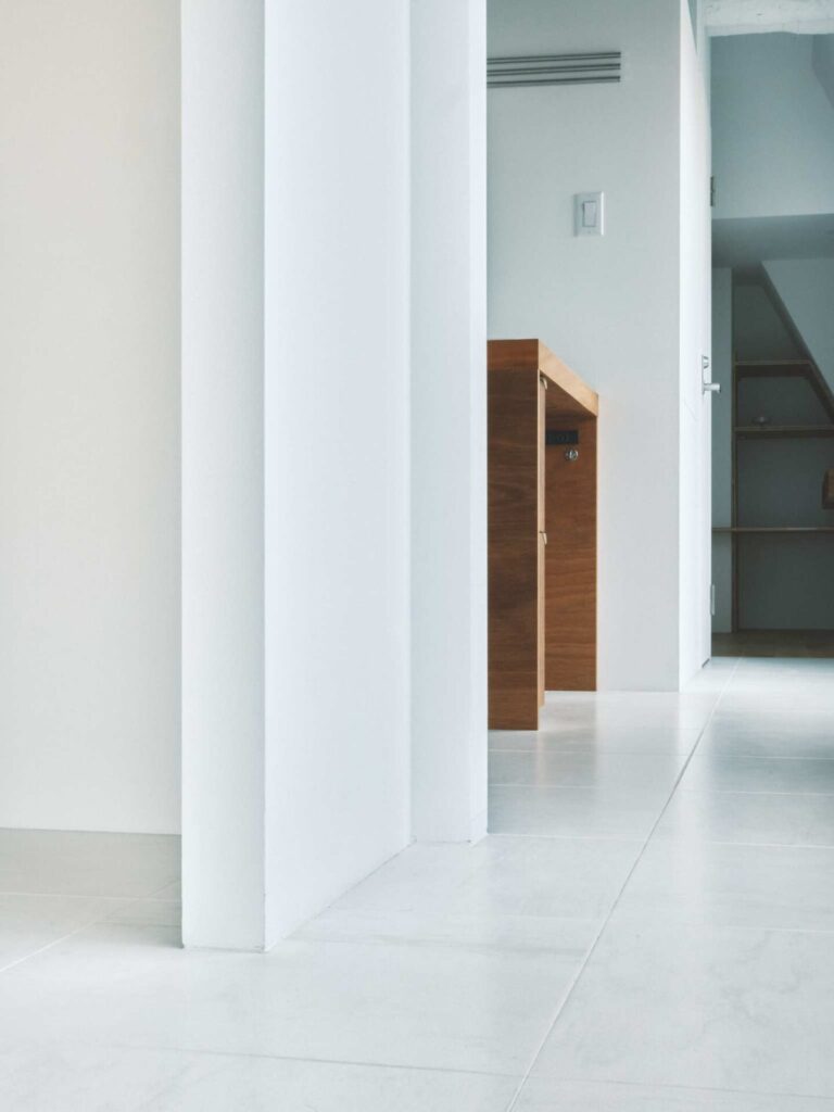
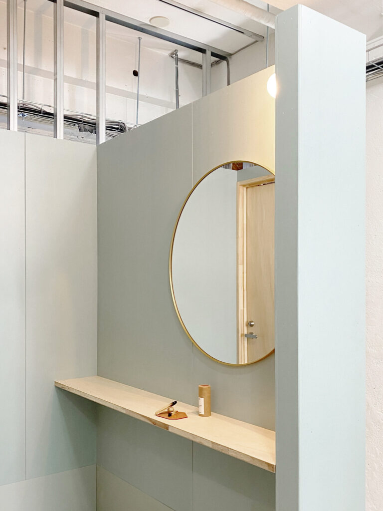
あまり大きくはない面積の「中」で、どのように「外」を感じられる部屋になるか、そしてそのキラキラして爽やかな明るい室内でどのように魅力的に生活が差し込まれるべきかを検討していく。
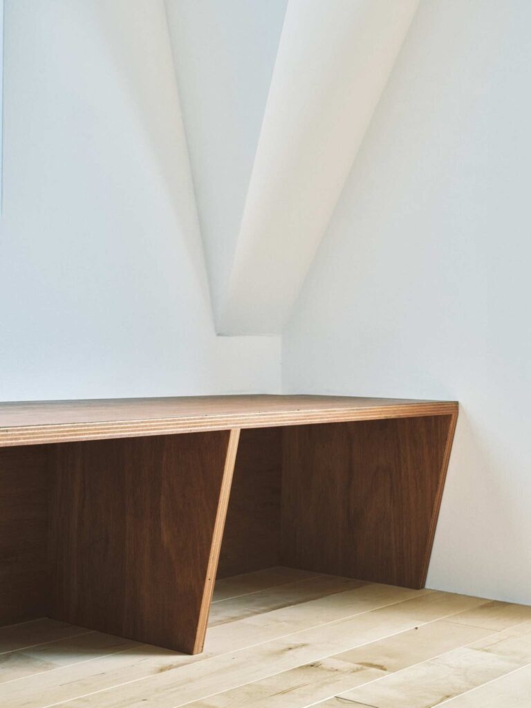
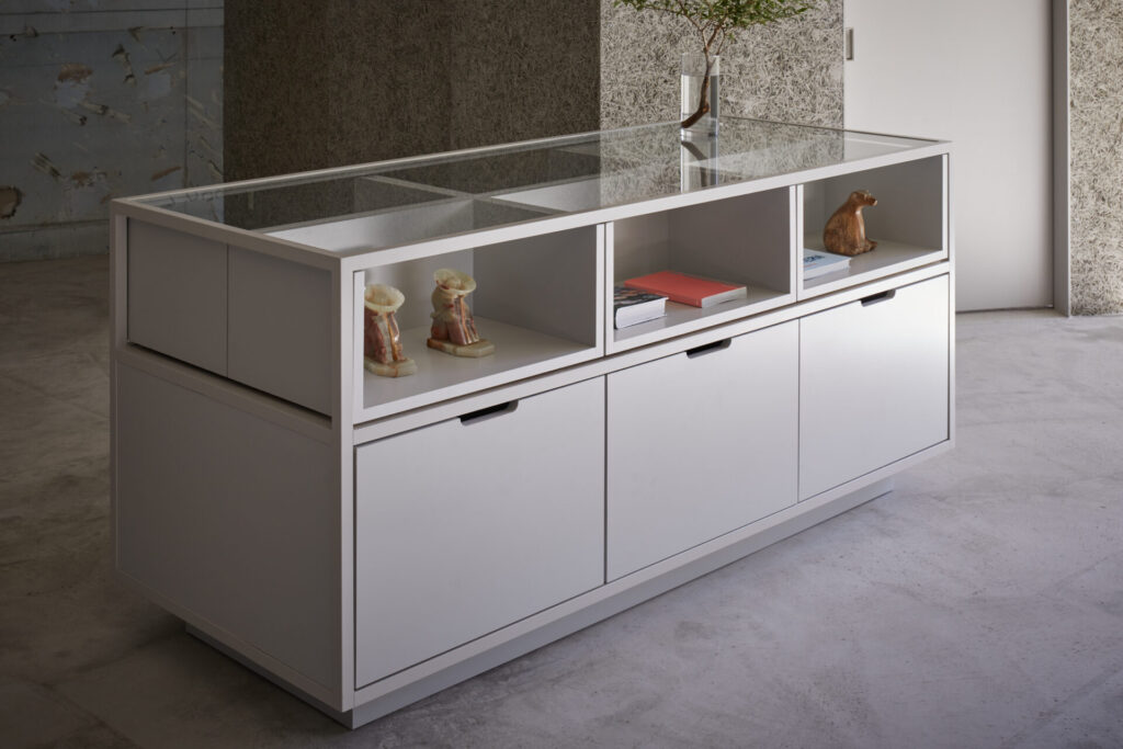
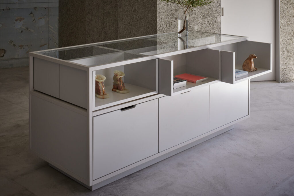
具体的な生活像を想像し、最終的にはベンチや洗面台のような家具が窓辺に寄り添うように配置され、光と風と生活を伴った気持ちの良い廊下が全体を包むような部屋になっていった。
また、これらの造作家具は長い年月の利用に耐えられるように、仕上げ方や補修の方法まで配慮している。
たくさんの物を置きたくなるような、たくさんの「物」と「生活」が美しく現れるような、心から気持ちの良い部屋になったと思う。
This is a renovation design for a single room in a reinforced concrete condominium in Tokyo.
The room to be designed is a southeast-facing corner unit, receiving ample sunlight and good airflow. Therefore, we thought of treating not only the interior space but also the abundant light and airflow as design elements that should be handled with care.
We considered how this natural light and breeze would reach the entire interior, passing through materials such as glass blocks, tiles, mirrors, and the sink.From the time the morning sun enters, the entire room becomes bright, with light reflecting off the glossy ceiling, even illuminating the bathroom tiles.
In this small space, we tried how to create a room where one can feel the “outside,” and how to design a charming and bright interior that makes daily life more attractive.
By imagining a specific lifestyle, furniture such as benches and washbasins are finally arranged near the windows, creating a pleasant corridor that is enveloped by light, air, and daily life. Additionally, these custom-made pieces of furniture were designed with consideration for their finish and repair methods, ensuring they can withstand years of use.
I think it became a room where you want to place many items, and where many “things” and “life” are beautifully arranged, creating a genuinely pleasant space.
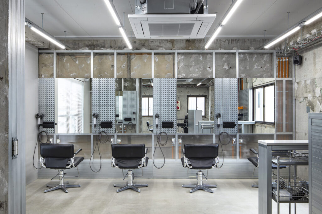
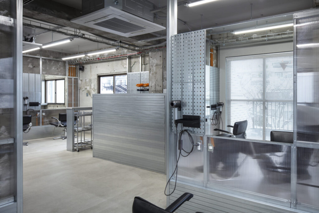
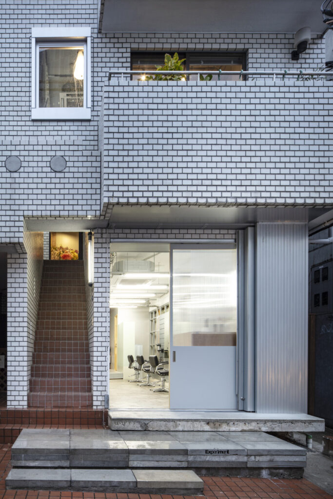
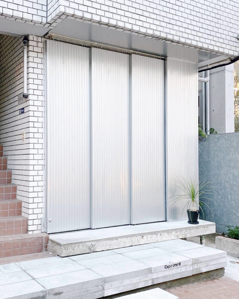
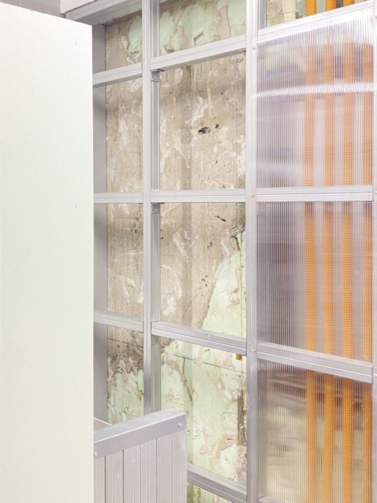
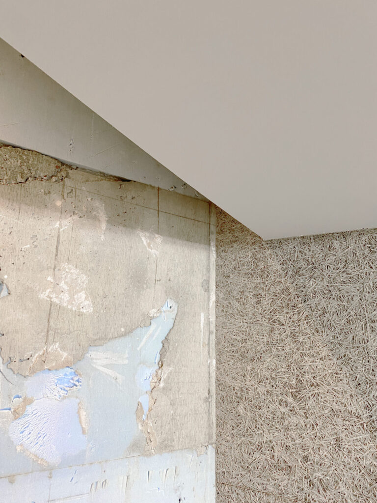
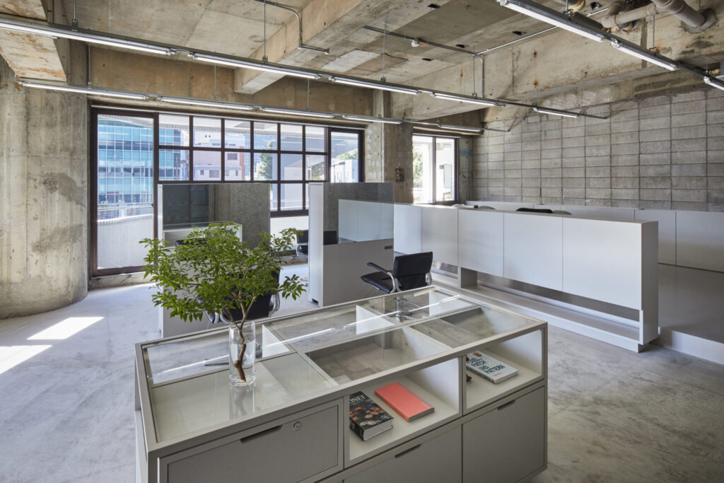
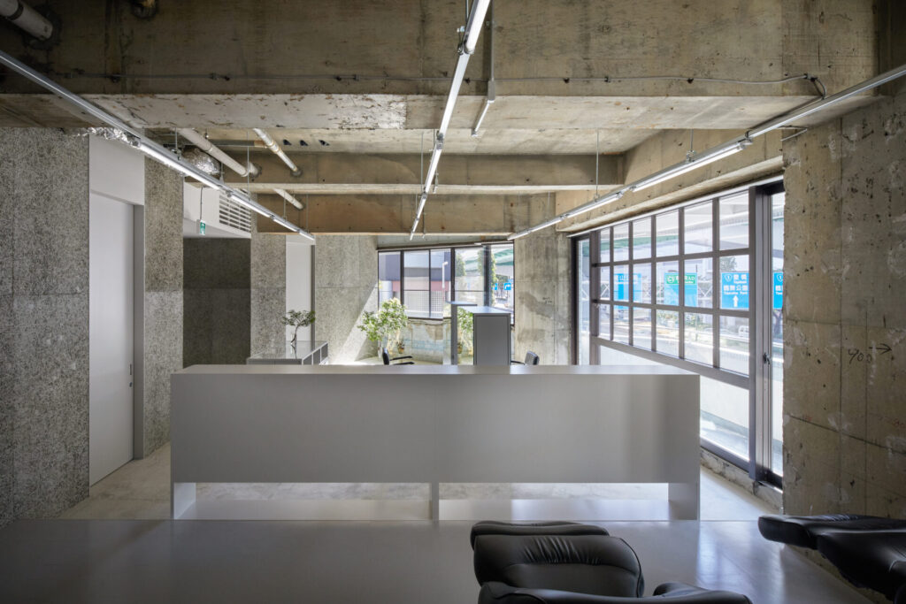
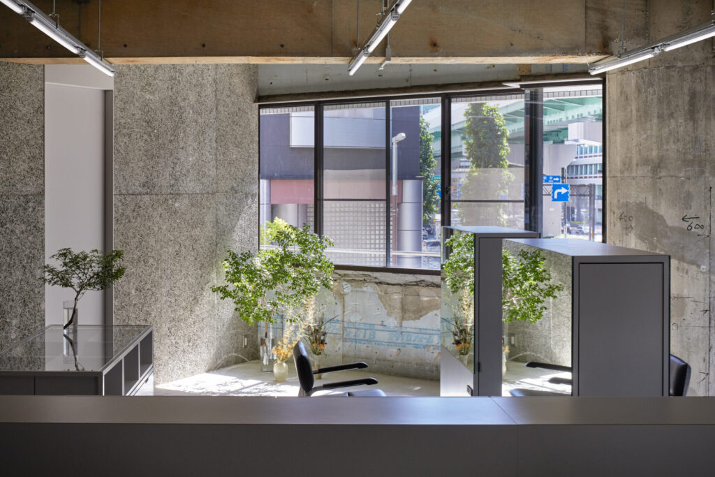
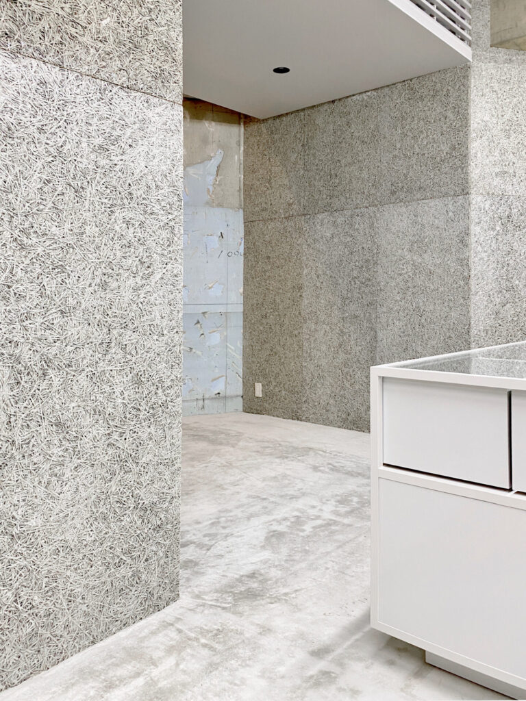
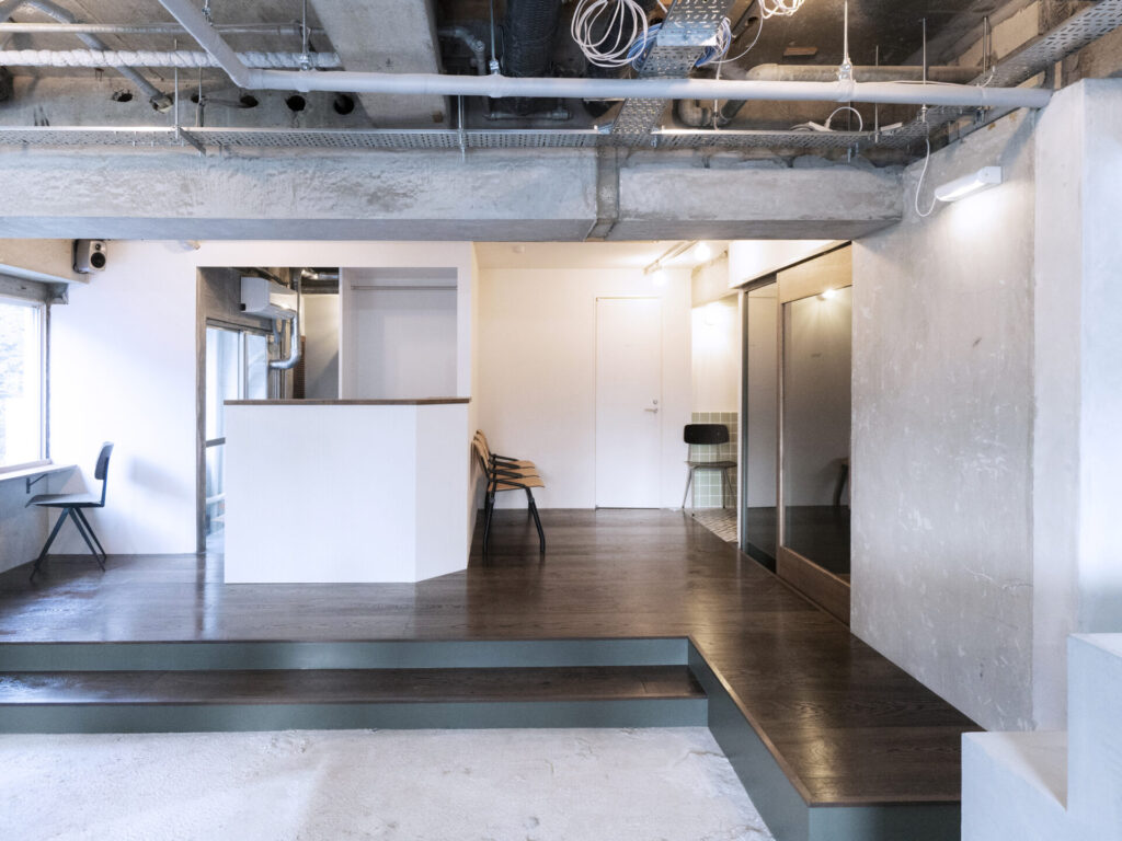
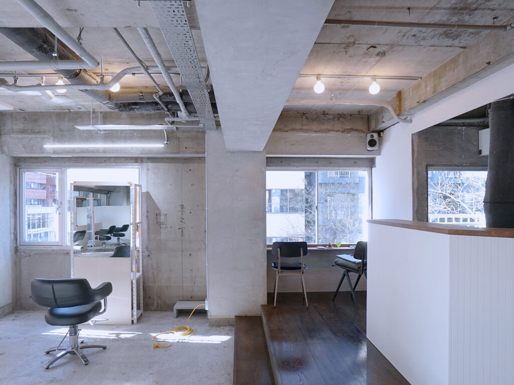
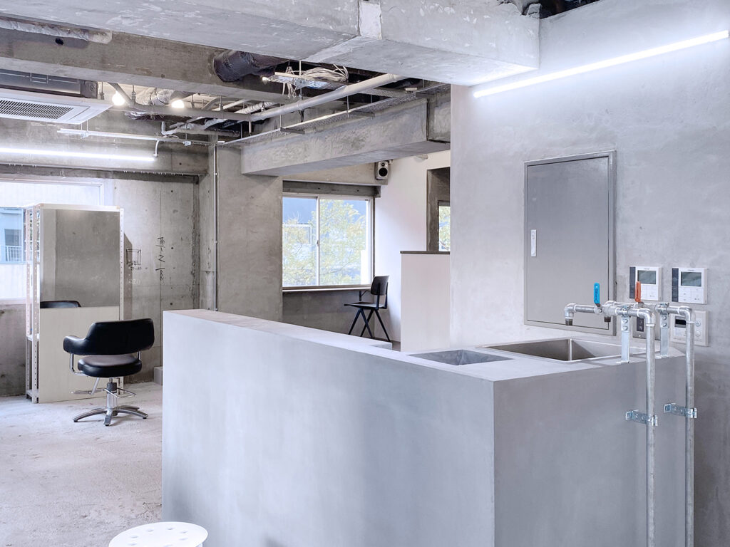
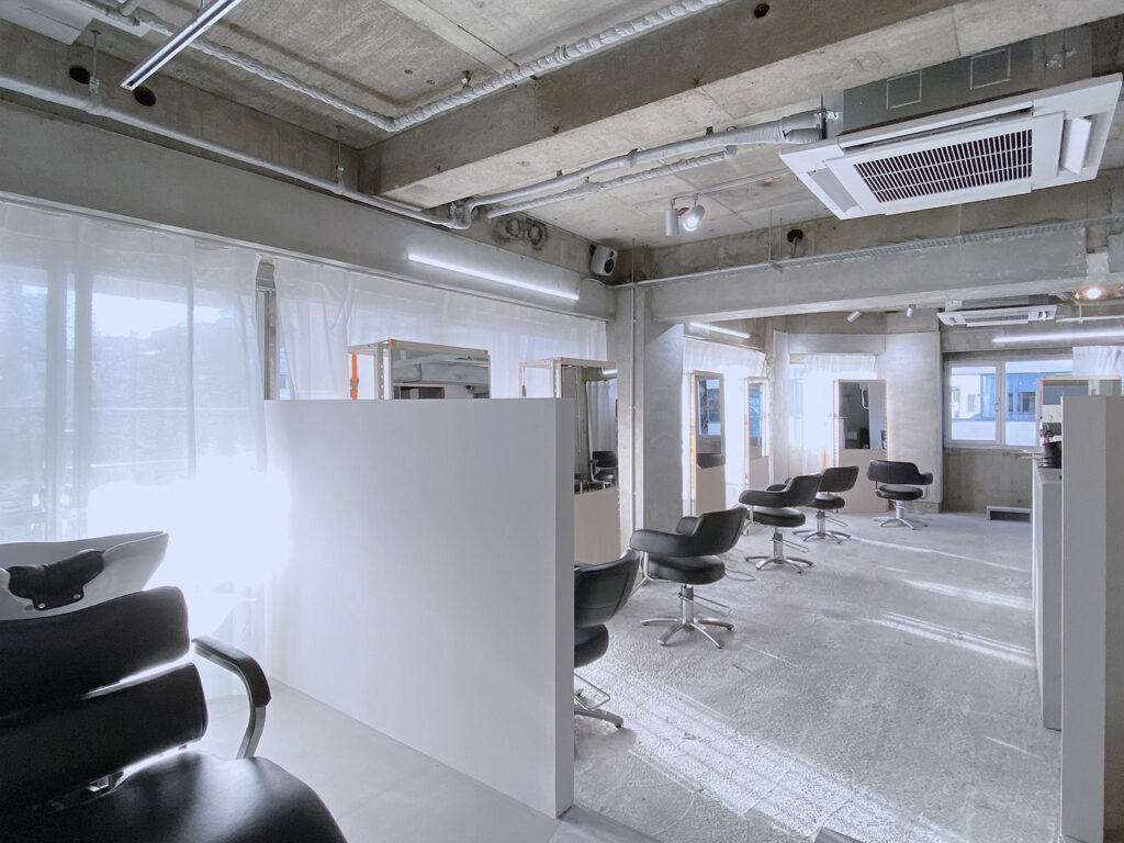
2021年に完成したヘアサロン hodosの2店舗目となるプロジェクトである。 設計の対象となる建物は築50年ほどのコンクリート造の建物であった。解体を進めていくうちに、思いもよらない段差や、個性的な姿が現れてくる。
そんな中で即物的に、足りない機能を補完しながら、全体として「Experiment(al)」= [実験的」な空間性を目指して検討を進めていった。
そのような実験的なサロン空間のデザインとして、予算を抑える常套手段である[表し]の先にある、「表し」の組み合わせで新たな表情を作るデザイン手法に挑戦した。
具体的には下地と仕上げの関係を細かく分解して再考している。
普段、建築の中で「下地」として扱われる材料を、分解・整理し、留め付けの方法や、勝ち負けなどのディテール、 そして下地の持つ色を丁寧に捉え直して、この空間に対してもっともふさわしい在り方に再構成している。
例えば、必ず使用する下地であるLGSをテクスチャーのある素材としても捉え、下地として使用しつつも、その直線的で鈍い輝きが美しくなるように、そこに組み合わせて行く他の材料や、ビスの種類、配線色、そのピッチや寸法を決めていく。
また、通常は仕上げとして扱われるメラミン材は下地であるプラスターボードの色に合わせて選択され、普段隠されるスタイロフォームの水色やCD管のオレンジ色も、最も活き活きと現れるにはどのような関係や構成ををとるべきか。など、下地の「表し」を超えて、その先にある組み合わせの美しさや冗長性を目指してデザインを検討していたように思う。
また、今回の空間は用途にも大きく影響を受けた。サロンワークだけでなく、本格的に花屋、プロダクトの販売もしていく実験的な店舗となるため、多くの物が入ることも想定される。
それらに対応して1店舗目と同じように、肌触りの良い仕上げが各所で必要な形で配され、それらに多様な物が置かれたときに、「表し」で配置された各要素と共に空間が出来上がるように考えた。
完成した段階で完成していないようで、次々と実験的に変わっていくのが楽しみな、そして、どこか1店舗目に通ずるhodosらしさもある場所になったと思う。
This is the second project of the hair salon “hodos,” following the completion of the first salon in 2021.
The building which we designed was an approximately 50-year-old concrete structure. During the demolition process, unexpected variations and unique features emerged.
Amid these discoveries, the design aimed to create a space that would organically “experiment” and evolve while complementing missing functionalities.
Proper placement of the base structure allowed for the addition of necessary storage even after the operational phase, as well as the emergence of new experimental finishes and uses.
Furthermore, this project involved an experimental and detailed reevaluation of the relationship between the base structure and finishing elements.
Materials typically treated as “base structure” within architecture were meticulously reevaluated in terms of attachment methods, detailing, and the inherent colors of the base structure to reconstruct them in the most suitable way for this space.
For instance, melamine material, typically used as a finishing surface, was selected to match the color of the base structure, creating a reversal of the conventional relationship between “finishing” and “base structure. ”
Consideration was given to how the hidden polystyrene’s watercolor and the orange of the CD tube could be organized to appear most beautifully.
The space was significantly influenced by its intended use. It is designed to serve as an experimental shop, not only for salon work but also for flower arrangements and product sales, accommodating the expectation of various items.
In line with this, throughout the space, tactile finishing elements were thoughtfully integrated, similar to the first salon.
At the completion stage, it may not seem entirely finished, with ongoing experimental changes being eagerly anticipated.
It has become a place that reflects the essence of “hodos” while offering a sense of familiarity akin to the first salon.
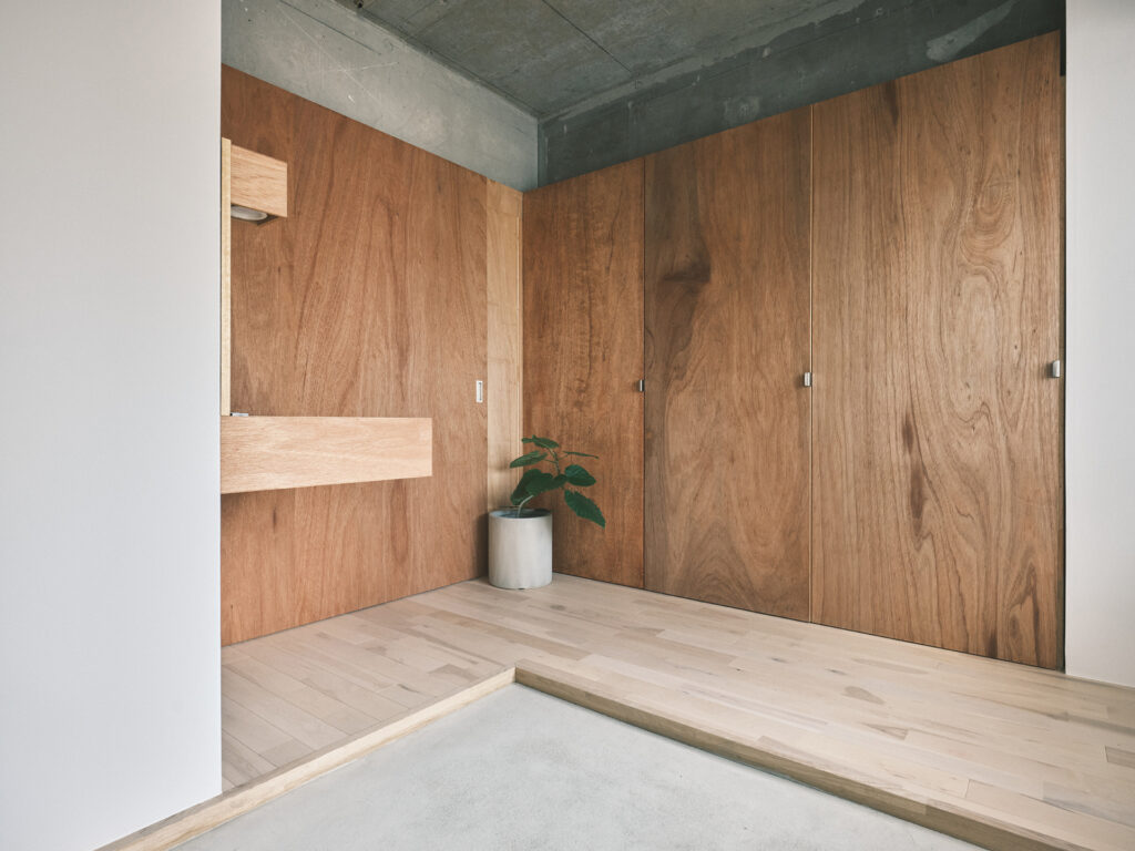
名古屋の高岳に位置するヘアサロン “casey”のデザインを行った。
クライアントの稲垣さんのための最初の店舗となり、機能性とともに、caseyの美学に寄り添いながら、これからの成長を見据えたデザインとなるように検討を行った。
また、対象の物件がある高岳は落ち着いた印象の町で、Caseyがその町の一員となるように、どこか落ち着いた姿を作り上げたいと考えていた。
Caseyのコンセプトに寄り添うように、過度に装飾的でなく、また、無理に仕上げ過ぎずに、心地よい空間を作り上げられないかと考えていく。具体的には既存躯体のクセをそのまま見える形として肯定的に捉えていきながら、必要な機能を複数の家具によって作り上げていくことにした。
そのため、元々持つ躯体の姿を改めてしっかりと把握し、肯定的に捉えていく。
例えば、断熱材のスタイロフォームとコンクリート躯体が施工時に混ざり合いできた、マーブル柄のような壁や、多面体として作られている丸いRC躯体の柱、界壁となるコンクリートブロック壁なども見せ方によっては可愛く見えてくる。それらの特徴と、新しく入る機能的でシンプルな家具が一体となってCaseyの空気感を作っていくようにした。
これから、稲垣さんによって追加されていく様々な植物や花、物も加わっていく。躯体のマーブル柄や、ヴィヴィッドな色の本、柔らかい雰囲気の花々、それらが置かれる造作家具、全てがひとまとまりになって、楽しげで美しく落ち着いた空間ができあがったと思う。
The first hair salon to be opened by Mr. Inagaki, and the design was carefully considered to align with Casey’s aesthetics, anticipating future growth, and designing functionality.
Additionally, Takaoka, where the property is situated, is a town with a calm impression. Therefore, we aimed for the salon to have a calm impression and be a part of Takaoka.
Adhering to Casey’s concept, the design aimed to create a space that is not overly decorative and avoids excessive finishing, striving to build a comfortable environment.
Specifically, existing structural quirks were positively embraced, with multiple pieces of furniture fulfilling necessary functions.
To bring about this, a thorough understanding and positive interpretation of the original structure’s features were crucial.
For instance, walls resembling a marble pattern created by the mix of Styrofoam insulation and concrete structure during construction, polyhedron-shaped columns made of circular reinforced concrete structure, and concrete block walls serving as partition walls could be charming when presented thoughtfully.
These distinctive features, combined with new functional and simple furniture, contribute to the unique atmosphere of Casey.
Furthermore, various plants, flowers, and objects curated by Mr. Inagaki are continually being added. The marble pattern of the structural elements, vividly colored books, along with soft ambiance-inducing flowers, and the custom-made furniture where they are placed, all come together as a unified space, creating a cheerful, beautiful, and tranquil space.
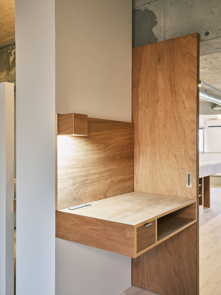
山下純平さんが1店舗目として開業するヘアサロンのデザイン/設計を行った。 物件の選定、空間の構想、設計まで、山下さんと共に長い時間をかけたプロジェクトとなった。
hodosに訪れる人々、また、hodosに入って来るであろう様々なアイテムや家具の雰囲気を山下さんとの対話の中で精度高く把握し、内装の完成時はもちろんのことだが、運用が始まり人や物が入ったときに最も魅力的になる空間を目指した。
山下さんのために昔からあるような姿であり、同時に、どこか新しさも感じ、 単一のコンセプトに収束しないような多義的なデザインになればと考えていた。加えて、対象としたテナント区画の変則的な形状に合わせて雰囲気が大きく変わっていくデザインとしている。
hodosの考えに馴染んでいくことを意識して、待合側はナチュラルな素材が多く、補色関係の色を持つマテリアルを積極的に採用している。
また、施術スペースは無機質な素材で構成され、色が少なく、主に外部に利用されるマテリアルを用いて作業場所としての性質が強いデザインとしている。
デザイン期間中、どのような家具を配置しようか、どのような照明を入れようか、そしてそこでどんな体験をしてもらうか、考えも更新され設計も調整されていった。
最終的には「更新性」と、ある種の「隙」を持つ空間デザインとなっていく。 サロンの成長に合わせて柔軟に家具が増えていくことを意識した什器設計とし、「hodos」の語源地域に近い産地の銅の釉薬を用いたタイルや、その組み合わせ/ディテール等を細かい部分まで検証を重ね、 物を置きたくなるようなデザインの隙のようなものを与えていく。
タイルの段差やニッチなスペースに物が並び、花が飾られ、それらの総体としてhodosが作られていく。
その後、山下さんたちは僕が思い描いていた以上にhodosを魅力的に使ってくれている。 遊びに行くたびに雰囲気が変わっていき、素敵な場所になってくれている。
This project involved a long period of collaboration with Mr. Yamashita, from selecting the property to conceptualizing and designing the space.
We aimed to create a space that would be most attractive not only when the interior was completed but also when it started operating with people and items, by accurately grasping the atmosphere of the people who visit hodos and the various items and furniture that would be brought into hodos through discussions with Mr. Yamashita.
Seeking for a design that would have a sense of familiarity for Mr. Yamashita, as if it had always been there, yet at the same time, we wanted it to have a touch of freshness, avoiding converging into a single concept and instead becoming a polysemous design. We were conscious of aligning with hodos’ vision, so the waiting area incorporated many natural materials and actively used materials with complementary colors.
In contrast, the treatment space was composed of inorganic materials with minimal color, emphasizing its nature as a workspace primarily used externally.
During the design period, we constantly updated our thoughts of placement furniture, lighting, and the experiences we wanted to create. In the end, the design became one that prioritized “flexibility” and included a sense of “openness.”
The furniture design was also mindful of the salon’s growth, with the flexibility to bring in additional furniture.
We meticulously examined tiles made with copper glaze from the region close to the origin of the word “hodos” and their combinations/details, aiming to create a design with small details that would make people want to place things. Items and flowers are displayed in tile steps and niche spaces, and they become a part of hodos, making the whole.
Afterward, Mr. Yamashita and his team have been using hodos in a way that exceeds my expectations. It changes every time I visit, and It impresses me as nice space.
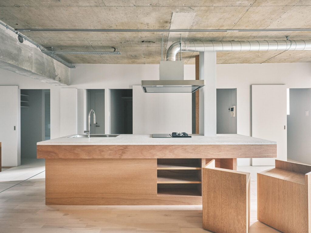
熊本市でのRC造マンション1室の改修デザインである。
解体前の部屋は4LDKの間取りで全ての部屋がそれぞれ窓を占有し、それらをつなぐ暗い廊下は風通しが悪く、北側の部屋はカビが生えるほどであった。
クライアントは定年を迎え、日頃から料理を楽しみ、勉強会や食事会などで友人と会う機会を多く持つ。そのような時折訪れる来客と共に過ごす場所であり、生活の中心となるスペースからデザイン検討を始め、全体を構想していく。
そのような活動だけでなく、クライアントは日頃から風の気持ち良い日は窓を開けて暮らすような人で、そんなクライアントのために、空調に頼りすぎず、また照明も最小限となるような住人にとっての「普通」で、最も「健全」な部屋となることを目指した。
検討の中で、キッチンを中心としたオープンな空間を起点として、個室が窓を専有しないというルールを作り、常に空気が流れ行き止まりを作らないデザインを検討していった。個室が窓を専有しないようにすると、窓辺には余ったような空間が発生し、ぼんやり明るい風と光の入り口をつくる。
最終的には、この地域にとって数百年前に「普通」であった町家の形式のように、風の流れるオープンな空間と、引き戸によってそこに繋がるプライベート空間を持つ間取りに収束していった。
また、検討の中で室内の壁は、風や視線を過度に遮らないように半端な形状になっていき、天井に達しない壁や隙間をもった壁が多く現れ、ずるずると繋がる空間が出来上がった。引き戸とカーテンの動きによって風の流れと視線の抜けを季節や使い方に合わせて調整していく生活像が現れる。
普段は落ち着いて、時には多くの人が集まって、そのどちらをも許容できる空間となり、また、住人にとって常日頃から普通であった、風を感じることのできるような健康的で過ごしやすい場所になったと思う。
This is a renovation design for a single room in a reinforced concrete condominium in Kumamoto City.
The room to be designed was a 4LDK layout, with each room having its own windows. However, the dark hallway connecting these rooms had poor air flow, and the northern rooms were prone to mold growth.
The client, who had reached retirement age, enjoys cooking, hosts study sessions, and frequently dines with friends. As a place for such occasional visitors and the central space of client’s daily life, we began the design process and envisioned the entire spaces.
In addition to such activities, the client is the kind of person who enjoys living with open windows on pleasant, breezy days. Therefore, we aimed to create a space that is “ordinary” for the residents, relying less on air conditioning and minimizing lighting.
During the planning process, we decided a rule that no individual room should exclusively occupy a window, promoting a continuous flow of air throughout the space and avoiding dead ends. By ensuring that no room monopolizes a window, we created spaces beside the windows that allow a soft and bright entry of air and light.
Ultimately, the layout converged into a design reminiscent of traditional townhouses(町家) from centuries ago in this region, featuring open spaces with a flow of air, connected to private areas by sliding doors.
Furthermore, the interior walls took on partial shapes to avoid excessive obstruction of airflow and lines of sight. By creating walls that do not reach the ceiling and walls with gaps, a seamlessly connected space was formed. The movement of sliding doors and curtains allowed for adjustments in airflow and visibility according to the season and usage, giving rise to a lifestyle that adapts to different conditions.
The space is designed to be accommodating and can handle moments of calm as well as gatherings of numerous people, all while remaining a place where residents can feel the fresh air. It has become a healthy and comfortable place, representing what has been “normal” for the residents.